
Logo usage
The Vermeer logo family
The Vermeer logo – our company emblem – is the paramount visual representation of our premium brand. It is the primary visual identifier intended to be used globally and must always be highly visible and never altered in any way.
The Vermeer logo family is comprised of four different logos and four graphic components:
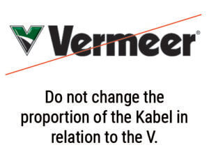
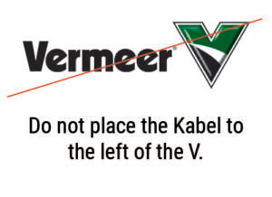
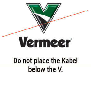
- The Vermeer name wordmark, often referred to as the “Kabel.” This mark is where it all began. It is the consistent connection to our heritage and foundation.
- The green portion of the logo represents the organic elements of our business – forage, tree care, rental, landscape, recycling and forestry.
- A white swoosh, connecting the top and bottom of the V, represents our consistent and continuous progress and growth.
- The black portion of the Vermeer logo represents the underground or ground-engaged portion of our business – utility, pipeline and surface mining.


Standard lockup
The standard lockup is the preferred Vermeer logo. When preparing external communication materials, the standard lockup should be your first choice.

Horizontal lockup
The horizontal lockup should be used in instances where the vertical height of the document would prohibit the standard lockup from being used at the minimum size.

Kabel wordmark
The Kabel wordmark is a suitable replacement for the standard and horizontal lockup when production requirements demand a simpler logo. The Kabel should never appear in text as a graphic element.

Vermeer V
The V is an option in limited cases where big visual impact is required or when communicating to an internal audience. When using the stand-alone V, it is important that the Kabel or word Vermeer is somewhere in close proximity on the finished piece (e.g., V on front of a cap, Kabel on back).
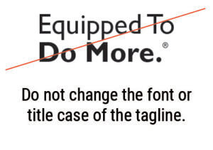
Our tagline
The primary way to communicate our promise is the company tagline, Equipped to Do More.® This tagline was developed to help our customers and prospects easily identify who Vermeer is and what promise we are making through our brand. It is meant to concisely communicate the key attributes or qualities of our brand.

Standard tagline lockup
The Equipped to Do More standard lockup is the preferred logo/tagline combination for externally facing communication materials where the tagline is applied.

Horizontal tagline lockup
The horizontal lockup should be used in instances where the vertical height of the document would prohibit the standard lockup from being used at the minimum size.

Stand-alone tagline signature
The Equipped to Do More signature should be used sparingly. When using the tagline signature, it is important that the V or standard Vermeer lockup is elsewhere on the finished piece.
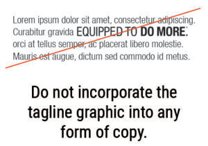
Using the tagline in copy
Proper and judicial use of the tagline in conjunction with the Vermeer logo emphasizes our promise to our customers and remind them that they are Equipped to Do More with Vermeer.
- Use the tagline sparingly in copy and speeches when emphasizing the brand promise through storytelling.
- Always keep the phrase Equipped to Do More intact as a unit. Do not add words or descriptions to the tagline for any reason.
- Include the registered trademark symbol after the first reference of the tagline on a page.
- When in text, use bold font to denote the tagline. The period after “More” can be excluded when using the tagline in the middle of a sentence.
- When using the tagline as a focal point in design outside of the approved tagline signature lockups, pre-approval from the Vermeer marketing team is required.
- Equipped to Do More formally replaces any former internal or external taglines, which may include “Supporting customers worldwide with better solutions.” or “In search of a better way…” or dealer-specific taglines.
Logo usage guidelines
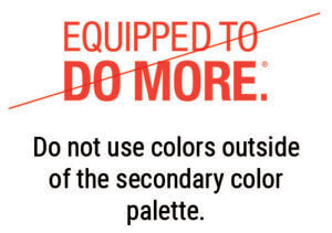
Color
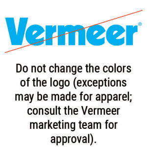
Vermeer provides both black and white versions of logos for use. Be cognizant of the background color and use either black over a light background or white over a dark background.

Logo variations
The Vermeer logo family is available in bevel, flat and one-color variations. Each is best suited for specific applications as outlined below.
Beveled logo
- When used, the beveled Vermeer logo is best suited for four-color print applications with some exceptions as outlined below.
- The beveled logo should not be used in one- or two-color applications.

Flat logo
- The flat logo should be used when the beveled logo is not able to be produced or when the application hinders the integrity of the beveled appearance. Examples include: two-color print applications, apparel, signage structures and digital properties.
- The flat logo should not be used in one-color applications.

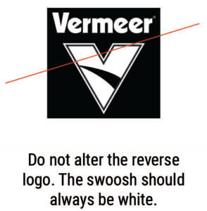
One-color logo
- The one-color logo should be used in limited applications such as black and white print production.
- When reversing the one-color logo, the swoosh should always remain white or lighter than the body of the V.
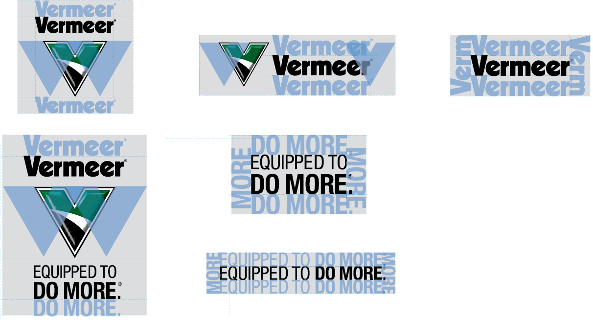
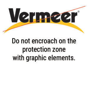
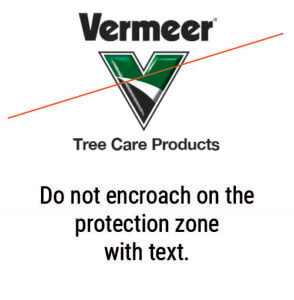
Protection zone
When using any of the Vermeer logos or tagline, always maintain the appropriate amount of clear space so they can sit uncluttered by other graphic elements. Protection zones must be respected in all applications and include elements such as: document copy, other logos and page edges.
The diagrams illustrate how to calculate the appropriate protection zone for each logo. The blue overlay elements illustrate how much clear space a logo requires. The gray box indicates the final protection zone for a particular logo.
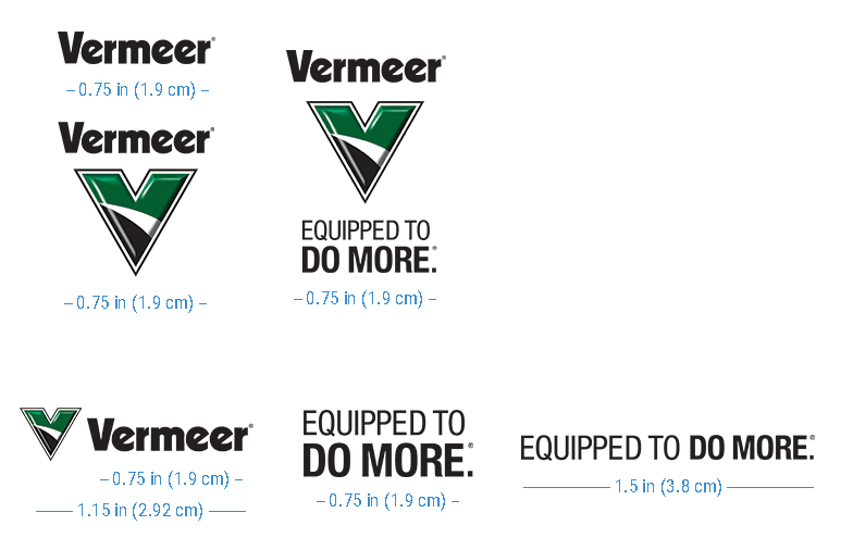
Minimum size
The logo and tagline should never be so small that legibility is compromised. The Kabel and the stacked tagline should never be reproduced for print applications smaller than .75 in (1.9 cm) wide. The tagline signature should never be reproduced in print smaller than 1.5 in (3.8 cm) wide.
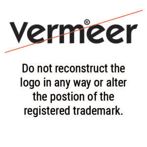
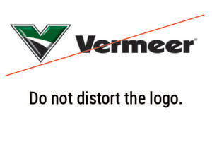
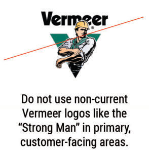
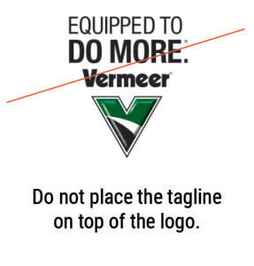
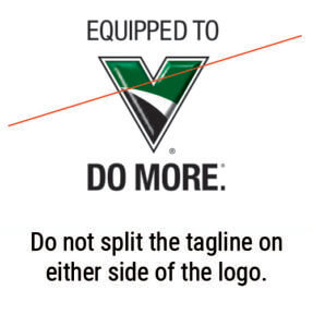
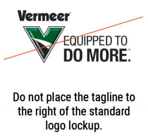
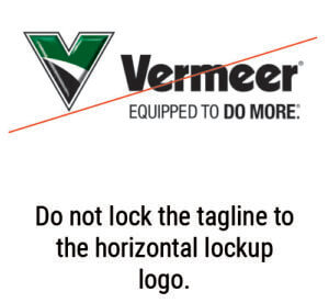
What not to do
Proper use of the Vermeer logo and tagline is important to maintain a consistent brand image. Use the guidelines below as examples of what not do to when using the Vermeer logo assets.

Vermeer dealers, please refer to compliance requirements related to Vermeer logo usage on the dealer portal.